Data Publics: Micro-Mapping nicotine addiction

For the Data Publics assignment, I decided to combine this project with my Citizen Science project, this is ongoing research and scientific project in which I want to use data visualization in order to show the genetic sequencing and correlate to a specific location in the map.

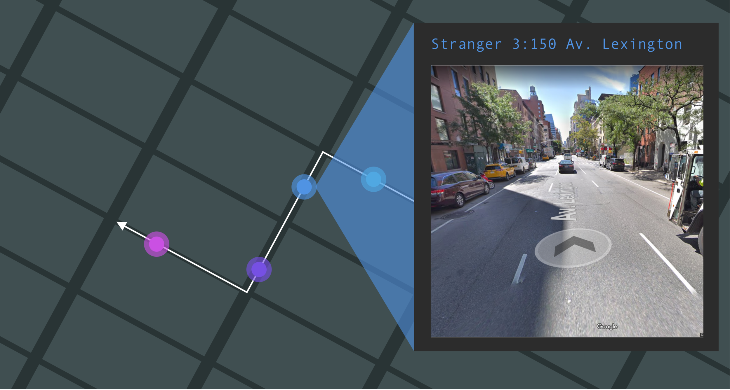
The experiment consists on a speculative piece in which I collect cigarette butts from the streets of midtown Manhattan, specifically, 5 cigarette butts collected in a 5 blocks walk from my office to the train station. The goal of the collection is to be able to identify which of these people who were smoking had genetic predisposition to be addicts to nicotine.

I decided to correlate each address (from where I picked up each of the cigarette butts) to each specific “stranger” and the goal of the continuation of this project is to be able to display as an overlay in the map a visualization of the AGTC code for each mutation identified in each person’s DNA.

Proteomic Data Visualization

For my archive assignment I decided to work with biological data. Tis is one of the reasons why I decided to take the Data Art class therefore I wanted to use this opportunity to navigate the process of collecting the data from a real organization, understanding complex data and defining a design process in order to be able to provide value out of the archived data.

I was able to collect the data from Ruggles Lab part of NYU Langone, at the beginning of my Summer internship I has the opportunity to talk to Kelly Ruggles after my colleague hard that I was particularly interested in biological data. Kelly mentioned that if I ever needed some data to play around with, to get in contact with her, therefore I thought this assignment was the perfect opportunity to get involved with some previously collected data. I also had some visual reference to one of the papers published by the Lab in which they were visualizing a similar set of data.

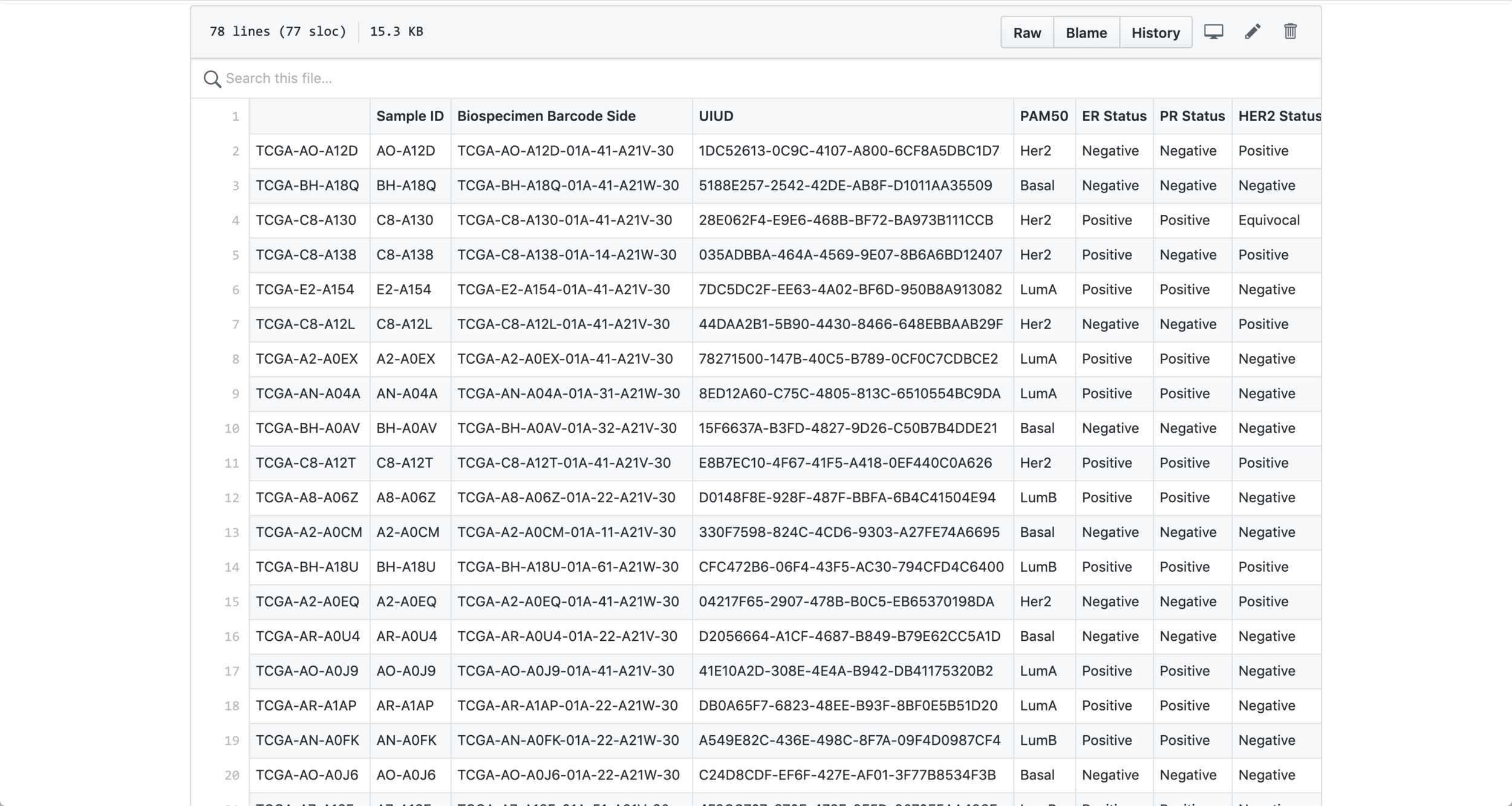
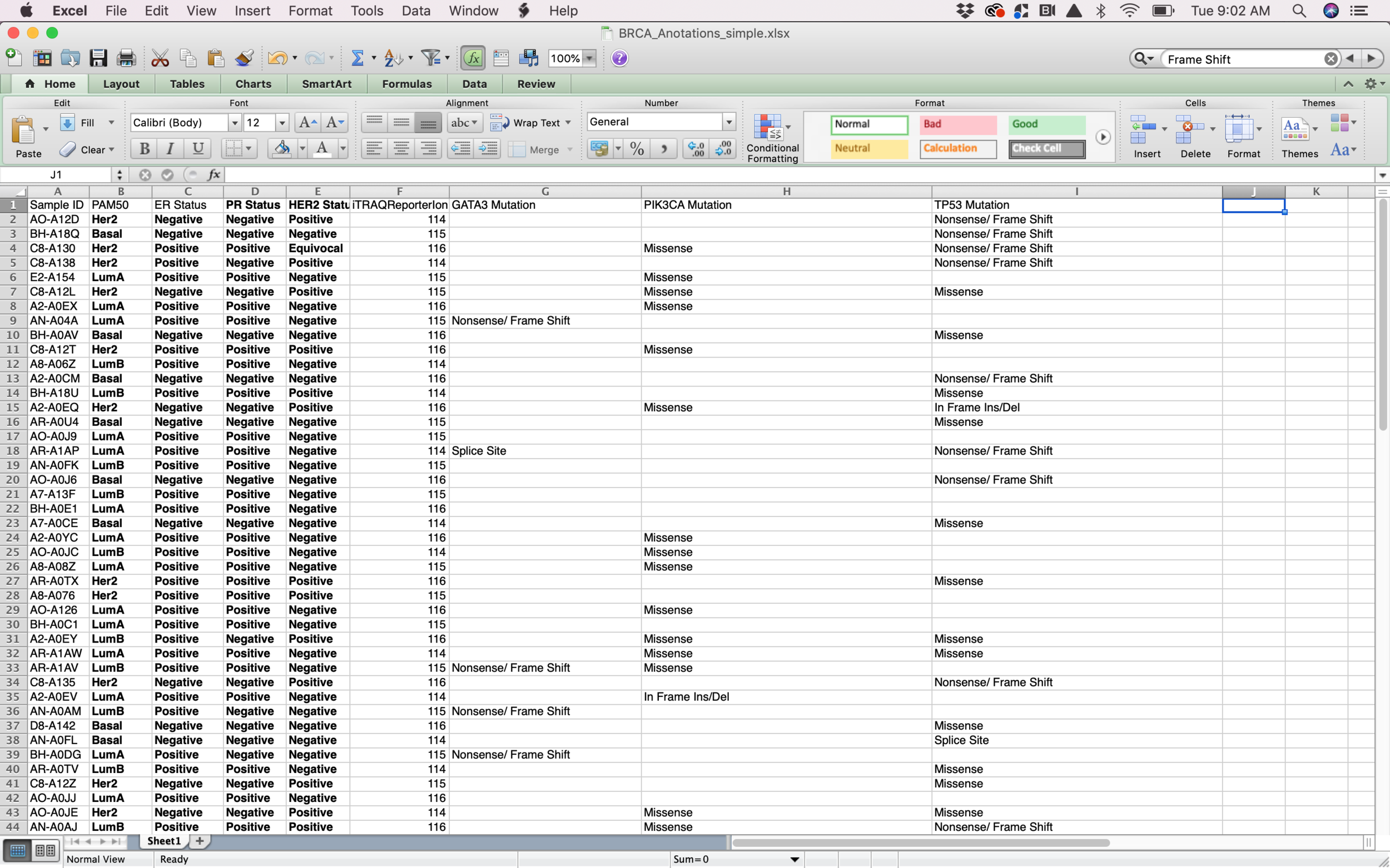
I started my process with a csv file containing information about BRCA Tumors (breast cancer). Probably the biggest challenge from this assignment was to be able to filter the data and select the columns that I assumed were going to be more interesting to visualize. After selecting the data, I had to do a big amount of research in order to be able to understand what each data point meant. From id to receptors all the way to mutations, I had to make sure that I at least understood the data that I was trying to visualize in order to generate something that made sense for the researchers.

When I decided on which data points to visualize and I was able to have a basic understanding of it I transformed the .csv file into a .json file in order to be able to work with it with Object Oriented Programming.

Data in json file

Data in json file

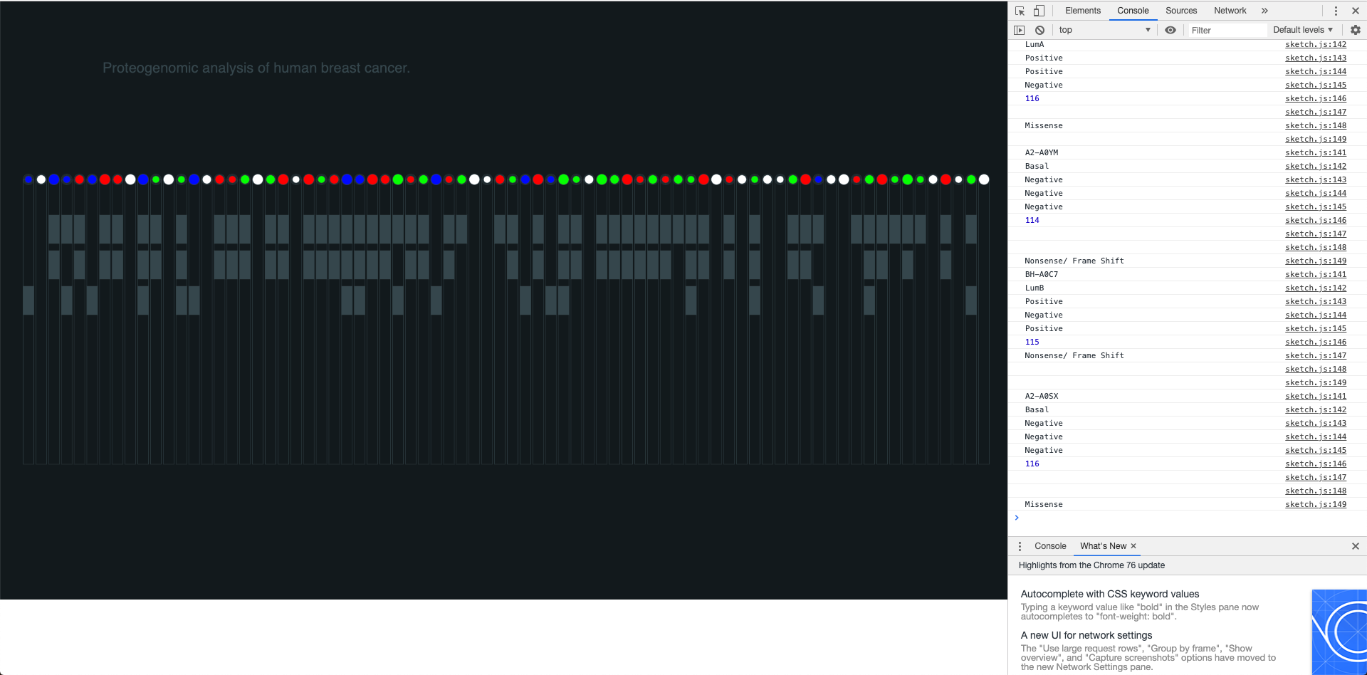
The sketching process was crucial in order to quickly iterate and find different visual proposals that would add value to the graph. I decided to visualize each tumor in a vertical line containing all the information related to it inside a rectangle. Showing the tumor type, the receptors, the ion and the mutations in a clear way was the goal for this part of the process therefore I had to test different ways to structure and visualize the data.

Understanding the data

Understanding the data

Sketching process

Sketching process

The visual design was very important for me because I wanted to make sure that I could create a visualization with enough legibility for the researchers, therefore the visual display of the elements and the color palette were crucial in order to ensure legibility and enough differentiation between all the data points and the different groups of data points (ions, mutations, receptors and type of tumor). The visual separation between the 4 sub-groups of data was intended to help the user read the information in a better way and using colors for only two and defining the other two (ions and receptors) in gray by only using the occupied space as an indicator helped me to visually separate the block of sub-data.

Visual design and color palette

Visual design and color palette

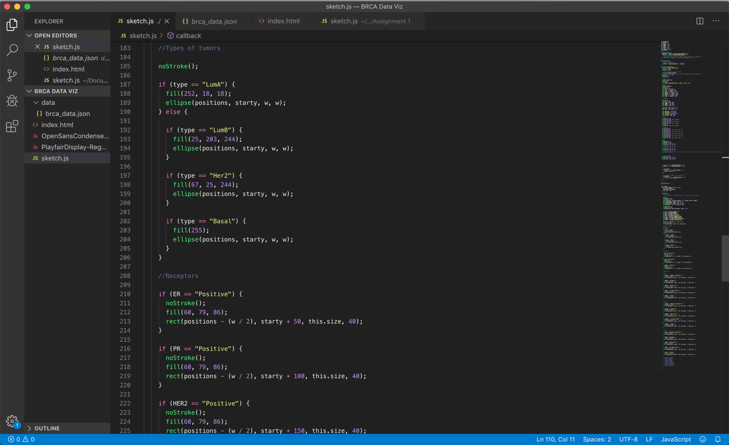
The coding process started by being able to generate an Object Oriented sketch, I wanted each tumor to be an object to be able to easily reference to it later on and extract all the data points for each one of them. I decided to visualize all the vertical rectangles (tumors) in the entire width of the screen in order to provide a way for the researcher to compare the data points next to each other.

I was able to generate a visualization that (although might not be a very efficient way of coding) is connected to the real data and shows interesting correlations between different data points and their sub-groups.

Coding Process
Coding Process

Coding Process

The final result is a graph that can be viewed in the browser, which is connected to a .json file and uses p5.js in order to display the data in the canvas.

Final Visualization

Data Selfie | Being a morning person

For my quantified self assignment I decided to track something that characterizes me as a person in order to create a data driven self portrait. I have always been a morning person, since I was a kid, my mom used to tell stories on how I wouldn’t let her or my dad sleep until late on weekends because I was already up and asking for breakfast since 6 in the morning. This is a characteristic that i have tried to use in my advantage in my adult life because it helps me be more productive and achieve a healthier lifestyle if I’m able to start my days at 6:00 am.

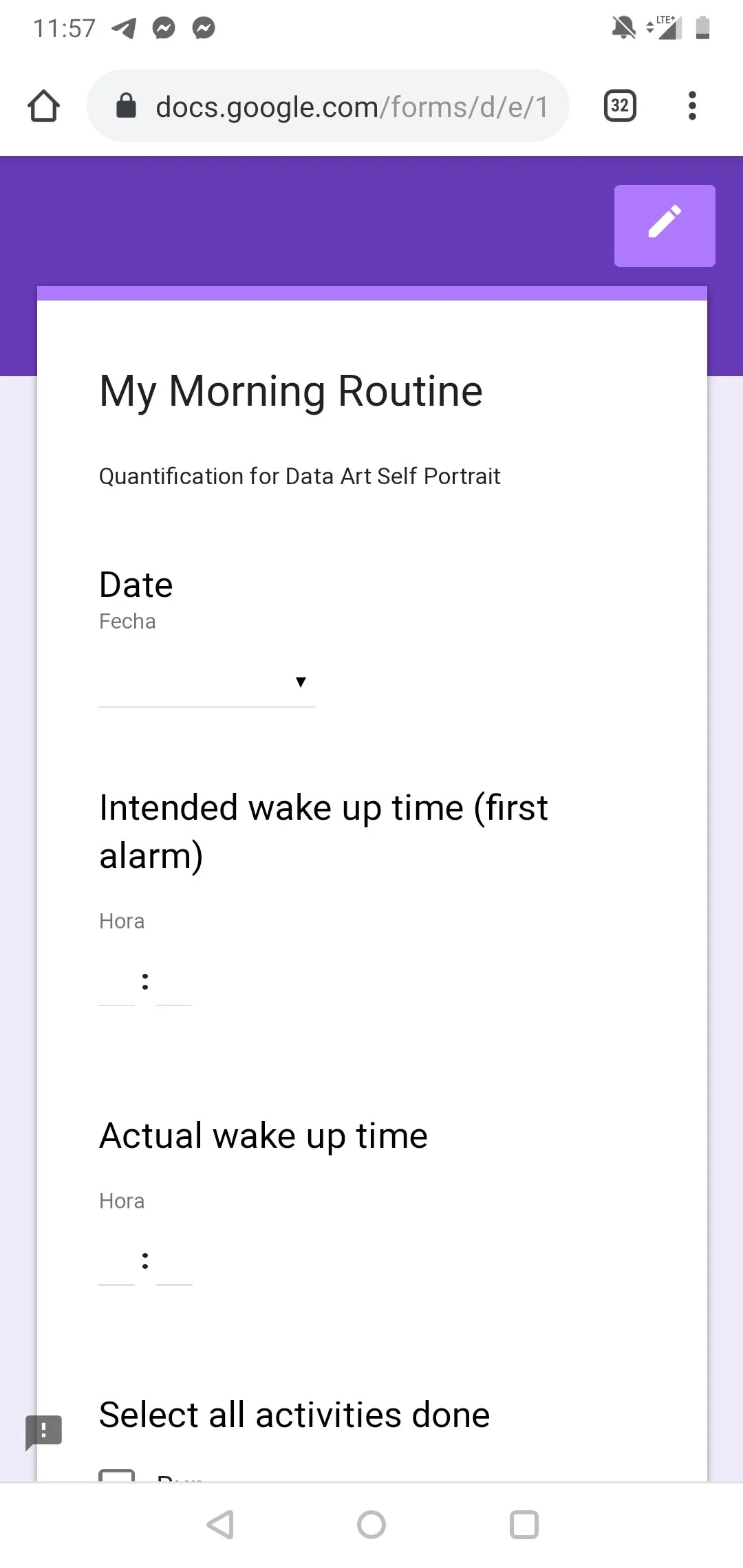
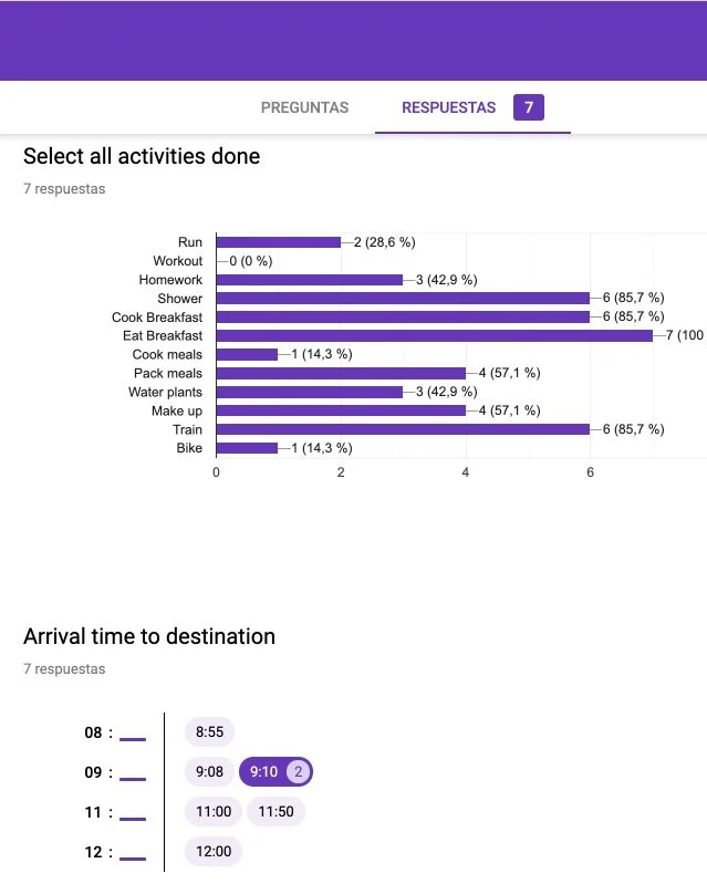
The way that I decided to track myself was by using a Google form, I designed it in a way I would be able to have different data entries, which I would later decide how to use. I collected my intended wake up time and my actual wake up time, all the activities done during the morning (selected with checkboxes), and the time that I arrived to my destination. My intention was to be able to visualize my very productive mornings versus the mornings that I “failed”, for example, on Thursday I intended to wake up at 6:00 am however I snoozed my alarm and woke up at 7:00 am instead, therefore I wasn’t able to go for a run that morning and in my head that counted as a non productive morning. I was particularly curious about how all of this information that I collected was going to look like in a unified graphic.

Mobile phone data collection

Mobile phone data collection

Data Analysis

Data Analysis

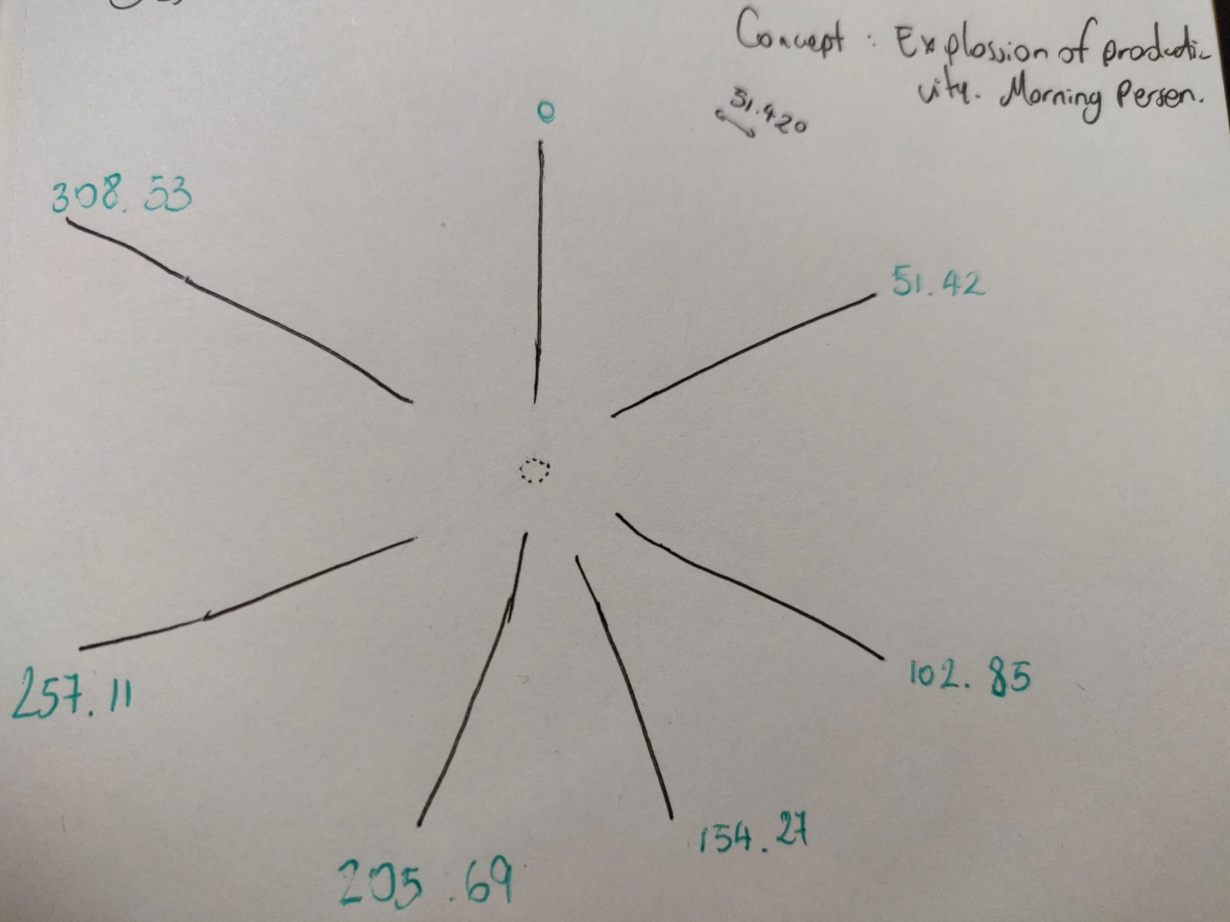
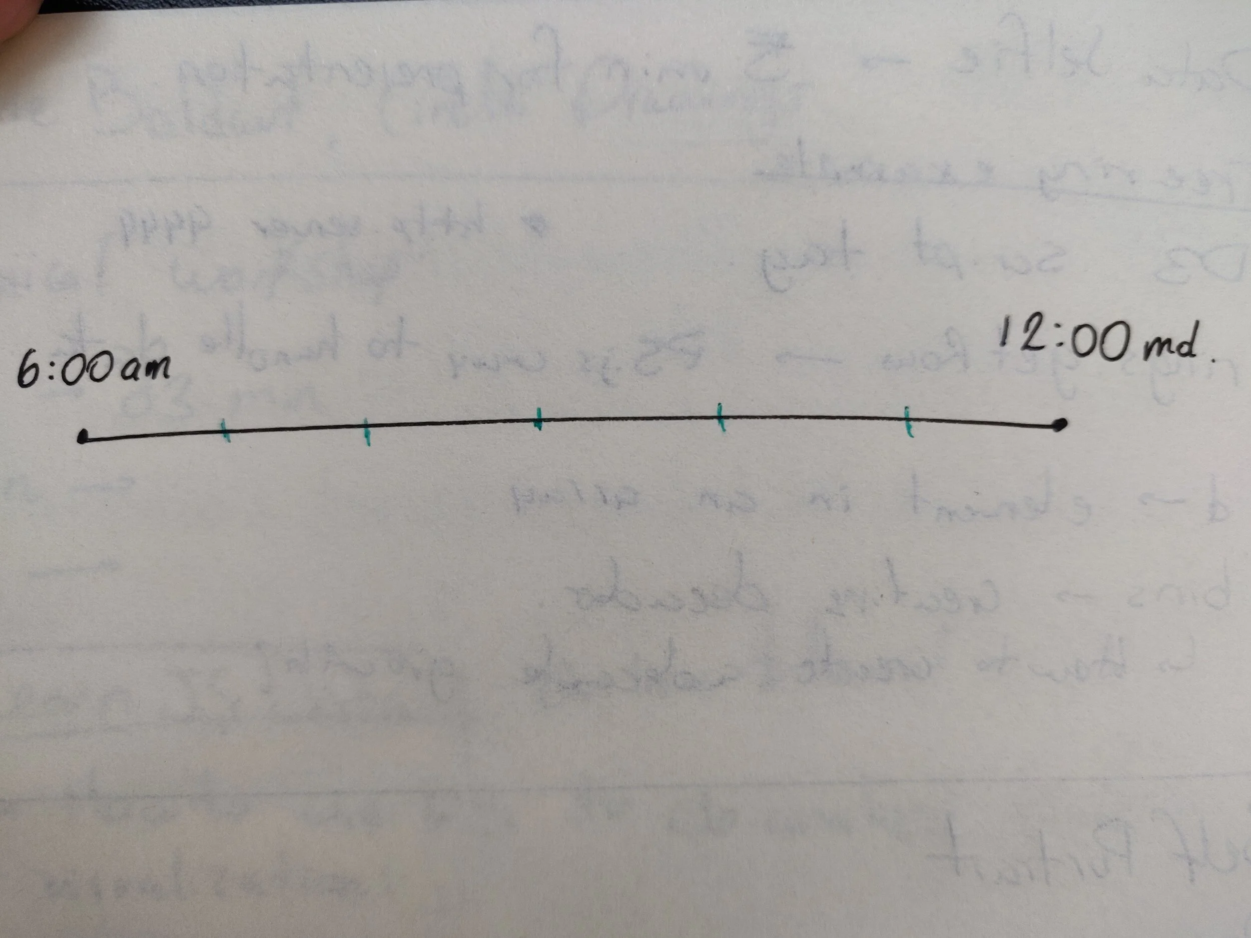
One I collected the information I started to sketch different ways to map the information in a radial distribution, I wanted to relate each day to an individual line and be able to compare the productivity of each morning in a very intuitive way.

Sketching

Sketching

Sketching

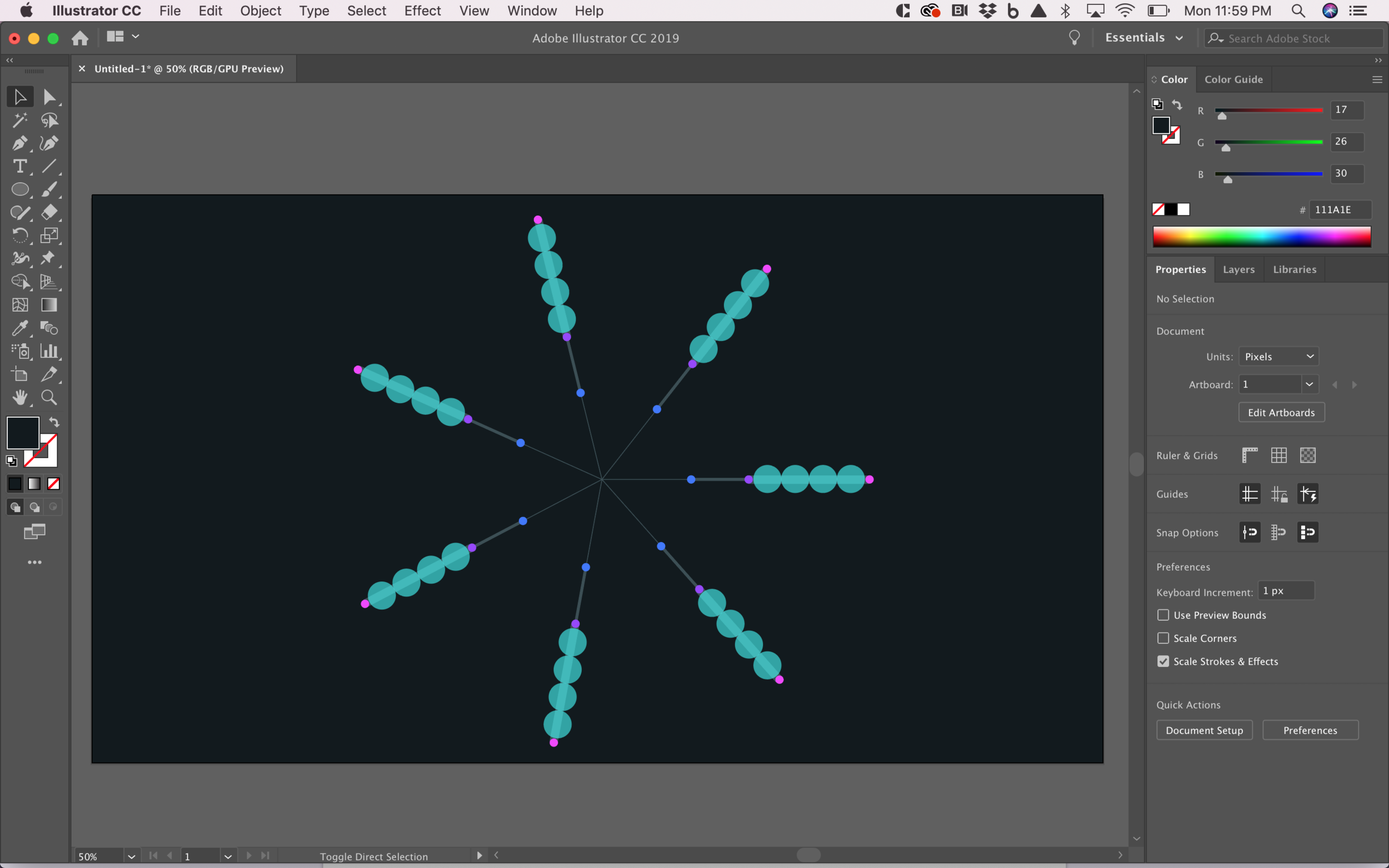
Once I had started to implement the data in my code by creating a .json file from the .csv file that I downloaded from the google form, I started to think about the visual design of the information, the use of shapes and different colors to represent the data in order for the viewers to understand the content of the graph. I used Adobe Illustrator to define a color palette, the diameter of the circles and the thickness of the lines, and later on, apply those visual details to my code.

Prototyping in Illustrator

Prototyping in Illustrator

Once I started to move forward with the coding portion of the assignment I started to face some barriers, I noticed that I should have created a more object oriented programming code in order to be able to access each individual day’s data, and I also notices how the visualization of the amount of activities was missing some context and I wasn’t able to display it in the way that I originally intended in my visual design. It was important to notice that in my Illustrator file I was able to create a design with a lot of freedom however when it comes to coding, that freedom has it’s consequences because that means that the coding will get more complex and I might not be in a point where I can achieve all those components.

Test1
test2

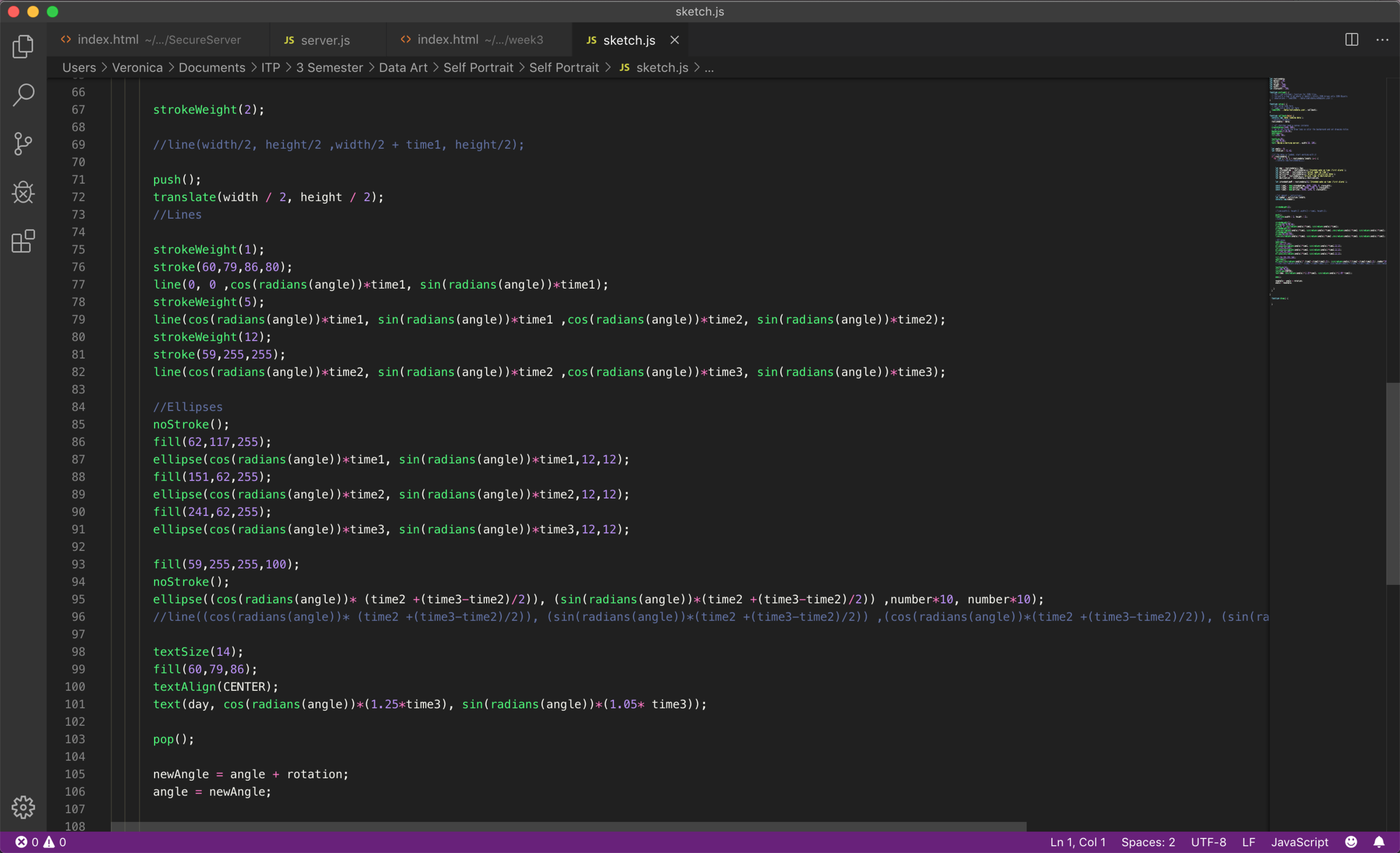
For the coding portion of the assignment I used p5.js in order to create the circular distribution of the days by using the cos and sin functions and creating different shapes (ellipses and lines) that were distributed in radial lines by dividing a circle in 7 in order to represent the totality of the collected data (7 days of the week).

code.png

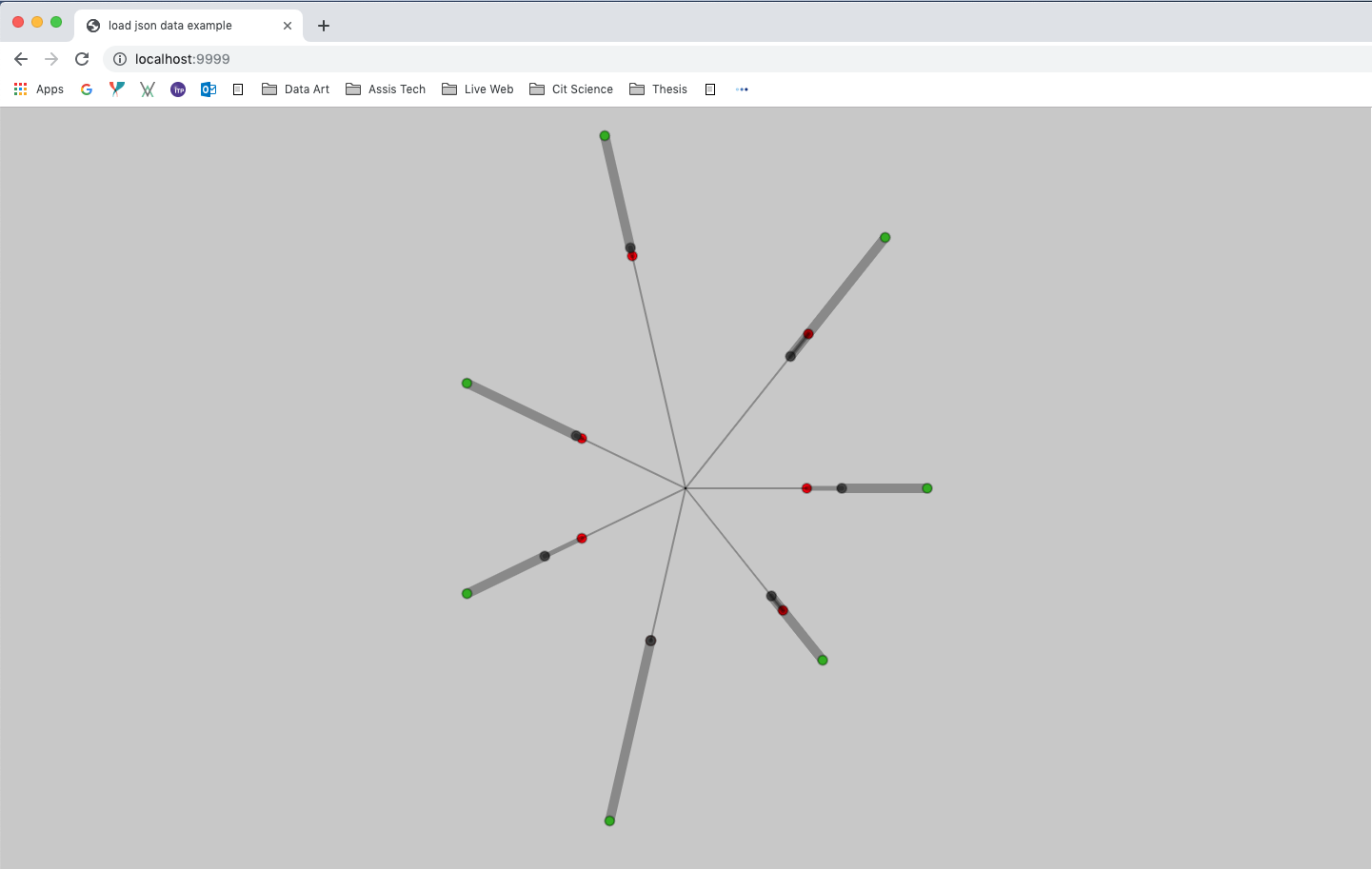
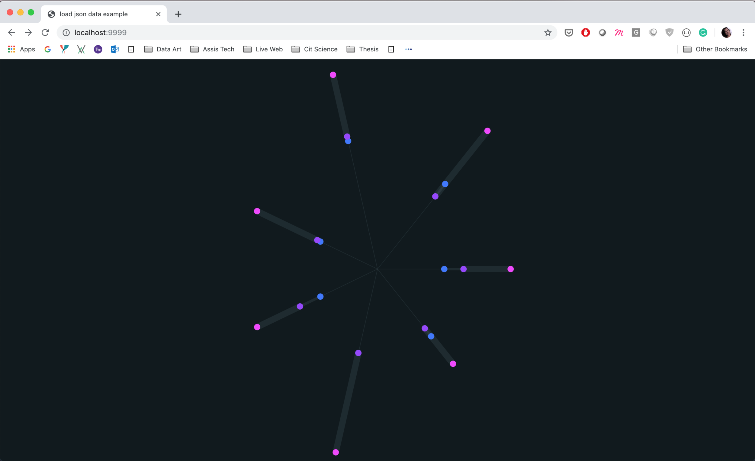
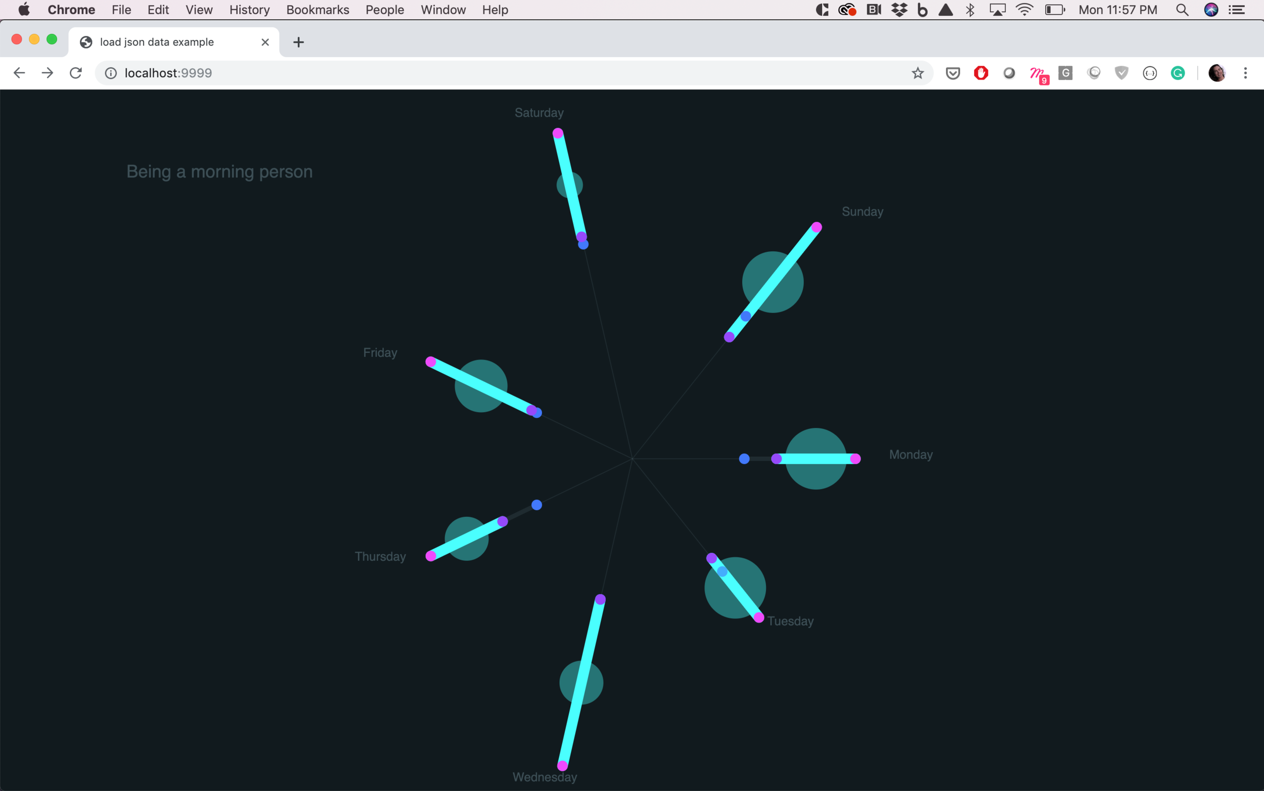
The final result is a data visualization that shows the intended wake up time (blue dot), the actual wake up time (purple dot) and the time that I arrived to my destination (pink dot). All those data points are displayed in a radial layout and I decided to represent the “effective” morning time by changing the stroke weight and the color for turquoise. It is possible to identify visually the duration of each morning and compare with the other days of the week. The last layer of information that I included was the mapping of the amount of activities done each morning, to the diameter of the semi-transparent turquoise circle that is located in the center of each morning stroke, the bigger the circle the more activities I performed that morning.

It is possible to visualize the difference between very productive mornings, such as Monday and Tuesday, in which the duration of the morning was short but the amount of activities performed was big, versus days like Saturday, in which my morning was very long however I didn’t perform many activities, therefore was a more inefficient morning.

Final Visualization

Final Visualization

Data Sketches

For the first assignment of the semester the intention was to start interacting with data sets and find a way to visually display the information. I decided to work with a .JSON file since it is a data structure that I understand and I felt more comfortable with. For this week I wanted to focus on understanding the data structure and how to navigate throw it. I also spend some time analyzing which p5.js elements I could use in order to create three different visualization of the information.

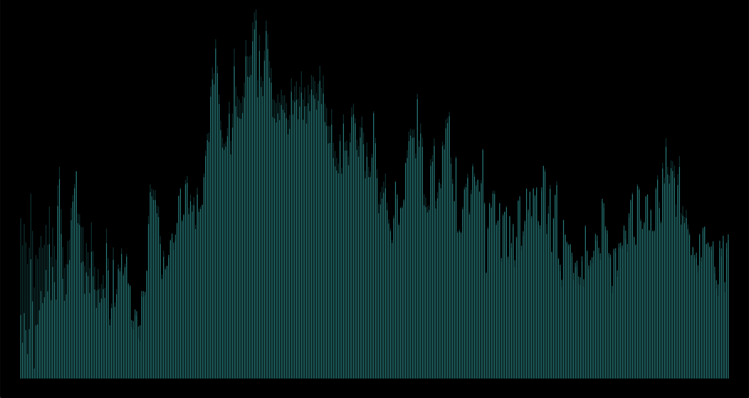
For the first proposal I used the base of data over time with the map functionality to display the years in the x axis and the ring width in the y axis, at the same time I wanted to create a visual comparison between the ring width and the growth index, therefore I displayed them in different colors and joint them with a 1px line.

The use of contrast to differentiate the main data point (ring width) vs the secondary data point (growth index) was achieved by using different colors and sized to the elements. I used rectangles with rounded corners in order to display the information.

Proposal 1: Ring Width vs Growth Index over time.

Proposal 1: Ring Width vs Growth Index over time.

For the second proposal I decided to continue working with the same distribution of the years and ring width however this time I wanted to try different contrast in the same elements, opacity and shape in order to create visual focus on the primary elements and display in the background the secondary data point as a point of reference. The problem faced with this visualization is that the only data points that can be shown in the secondary layer of information are the years in which the growth index was higher than the ring width, however I believe this exploration worked as a way to understand in which cases opacity and layering information can be useful or in which cases it might hide important information for the viewer.

Proposal 2: Ring Width vs positive Growth Index over time.

Proposal 2: Ring Width vs positive Growth Index over time.

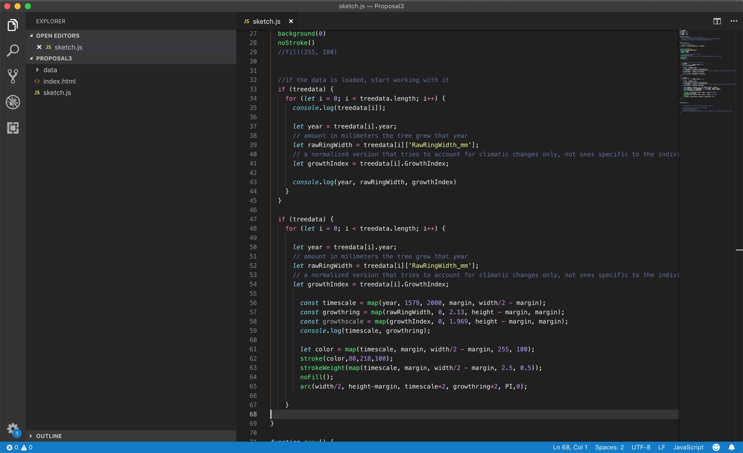
In the third proposal I decided to explore the concept of rings, I wanted to show the growth over time in a concentric way. I used the arc element in p5.js in order to achieve that. Once I was able to create an arc for each year (in the x axis) with it’s corresponding ring width (the height of each arc) I decided to use the mapping function in order to change the color and the stroke weight as the years pass. This is definitely a more abstract way of representing the data but it was interesting as a visual exploration of the possibilities with the same dataset.

Proposal 3: Years and Ring Width

Proposal 3: Years and Ring Width

Technical details:

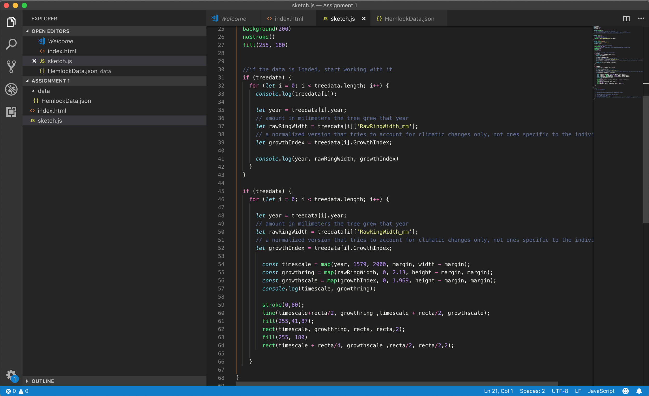
Code for proposal 1

Code for proposal 1

Code for proposal 2

Code for proposal 2

Code for proposal 3

Code for proposal 3