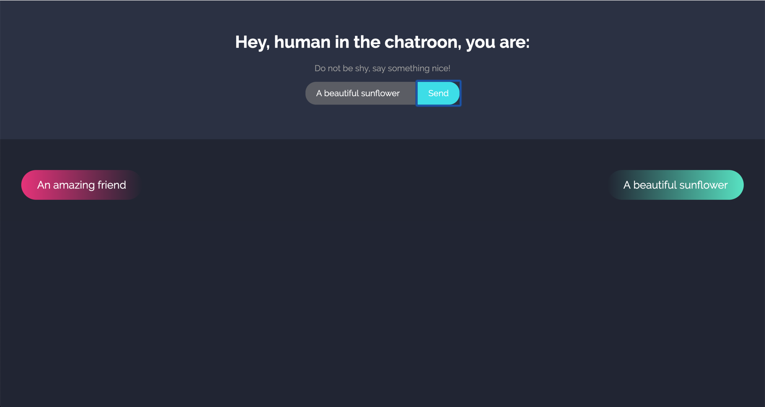
For this week assignment I worked on setting up a chat using web-sockets. The biggest challenge was to set everything up and running and after I was able to do so I decided to change the visualization and the content of the chat messaging board.
The first step was to make possible for a user that sent a text to see the content instead of just sending it and it disappearing.
Test 1: Make the sent message visible
The second step was to design a look and feel that was appropriate following some best practices, I decided to design it with “Dark mode” since it has been proven to be better for the eyes. I started the design process in sketch to be able to test color and size before implementing it in the code.
Design process using Sketch
The next step was to try to implement the User Interface Design previously created in sketch. This was a very challenging part specially because the divs for “outgoing” and “incoming” messages were being generated from the chat, therefore the information architecture had to be generated from there. My biggest challenge, and the one that I wasn’t able to solve, was to be able to visualize each bubble of text to the left and to the right, according to outgoing and incoming, but occupying the entire width of the container div.
The final result is a compliment chat that invites the users to give an anonymous compliment to the users in the connected users.


