For this weeks assignment I decided to work on top of the previous data collection and visualization app that I had adapted for correlating my feelings and emotions with the quality of the meals that I was eating and specifically in the aspect of eating alone vs eating with someone.
I wanted to create a way to quantify how many meals in total I have eaten alone and make a visual comparison vs the ones that I shared with someone and provide a message to encourage myself to try to share my meals more often since that is a good way to socialize and share conversation with friends during the day.
I started by creating a separate page for the “Intervention” that can be accesses from the home page where the individual visualizations for moods are stored. When the user clicks on “Intervention” the app will take him to a separate layout that will contain feedback on specifically the company on the meals.
Home page
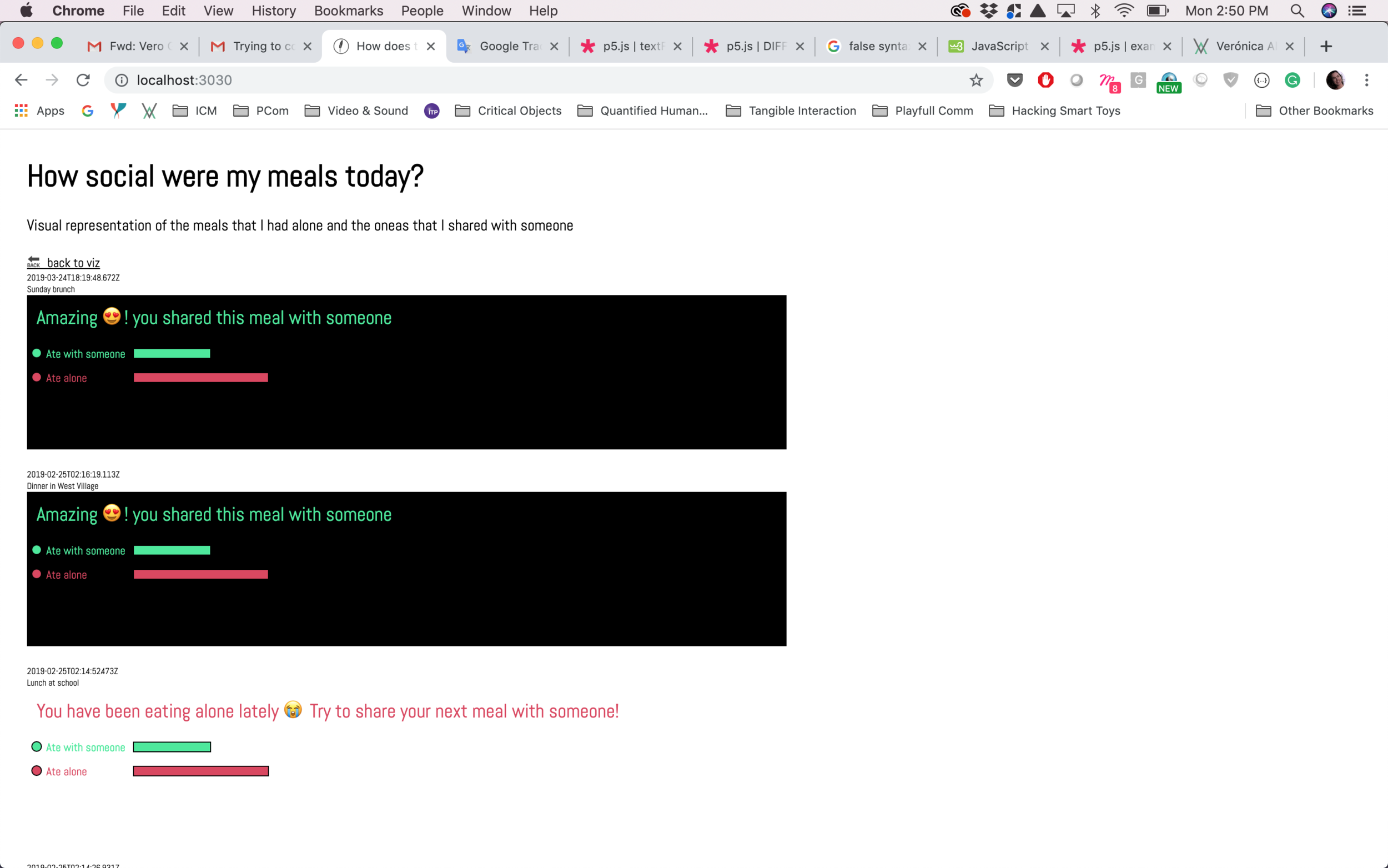
The next step was to change the visualization of the grid since I wanted to eventually be able to create a horizontal bar chart. I added two different messages with changing colors according to the input that the user typed for the company field.
Knowing that that might be a valid approach, I stylized the text and the icons to be similar than the icons used in the data input to be able to provide more consistency to the user.
At this point I started to research how to create the bar charts with the data coming directly from the data input which was more complicated than I anticipated because checking for that number in p5 was not a good idea, therefore I had to go back to the database and the data collection in order to determine which numbers to use in order to create the bar chart.
The last phase was to try to get the number of times that I ate with someone vs alone and compare it to the total amount of inputs. With that information I could visualize in the p5,js sketch or directly into the js file where I was receiving that data.
The end goal of my intervention was to be able to visualize if I was eating alone too many times in a row so that I could try to be more social during my meal times and hopefully improve my moods and feelings about the meal times.
I ended up breaking the sketch and I definitely believe that I was trying something way out of my knowledge, therefore I will continue with this idea for my final project and hopefully find a way to collect and visualize the information in the correct way.


