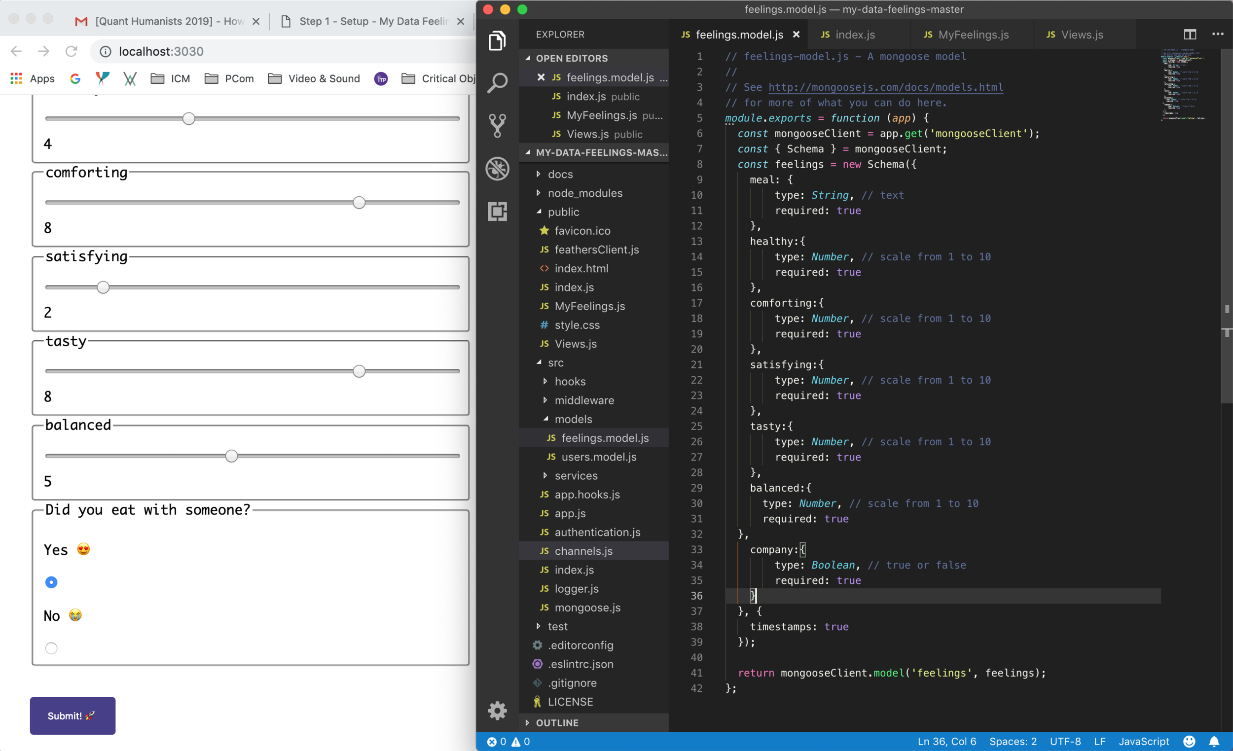
For this week’s assignment I decided to start working on an idea that I would like to develop for the final project of the course, start understanding how to manipulate the data visualization and the importance of collecting meaningful data in order to self track myself and make behavioral changes according to the knowledge acquired by doing this exercise.
I consider myself as a healthy person, who loves exercising and eating healthy food, but at the same time I enjoy exploring different restaurants, new food and experiencing places throw food. I have noticed that since I moved to NY, and obviously changed my lifestyle, it is more difficult to dedicate time to exercise and cook healthy meals which have been affecting my emotional health.
Another important aspect that I have noticed is that back in Costa Rica I used to have most of my meals surrounded by family and friends, in a calm and relaxing environment and with a lot of available time to eat, have drinks and enjoy conversations. This doesn’t happen that often with the ITP lifestyle, therefore I have noticed that I tend to eat alone and in front of the computer while I do homework, which have also been affecting me.
I would like to track how the quality of the food and the environment around my meals affects my mood and what can I do to improve my mental health (or at least prevent panic attacks and anxiety) by improving the way that I behave around food. It is important to mention that food normally makes me very happy and I try to do 5 meals a day: Breakfast, morning snack, lunch, afternoon snack and dinner (I know, it is a lot :p )
Defining the data input process
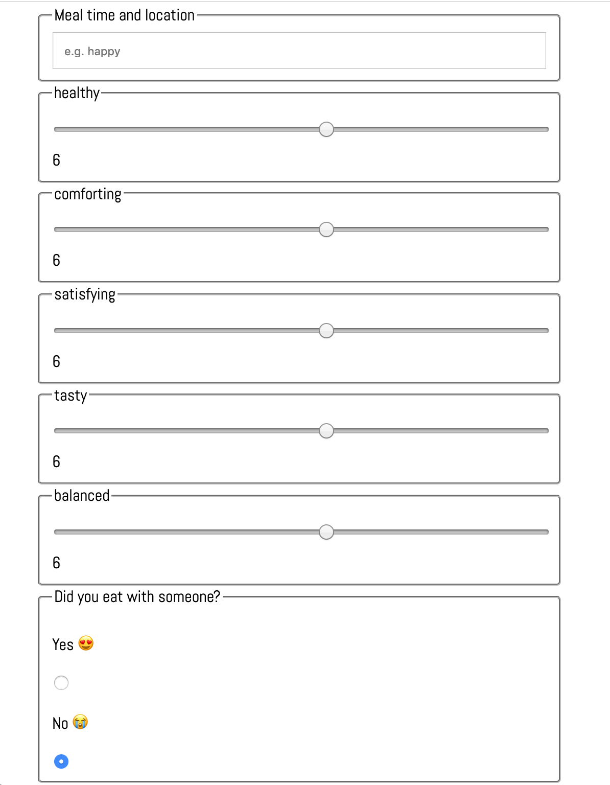
I started the editing process by connecting to the server (which took longer than expected) and then trying to change the visual style and the way that the data was being represented in each canvas. I also changed the data input fields according to the information I wanted to quantify about my body and the way that my mind behaves around food. This is how the data input fields look now: As the main data input: Meal time and location, as sliders (from 1 to 10) healthy, comforting, satisfying, tasty and balanced, and as a boolean, Did you eat with someone? (yes or no).
Data input fields
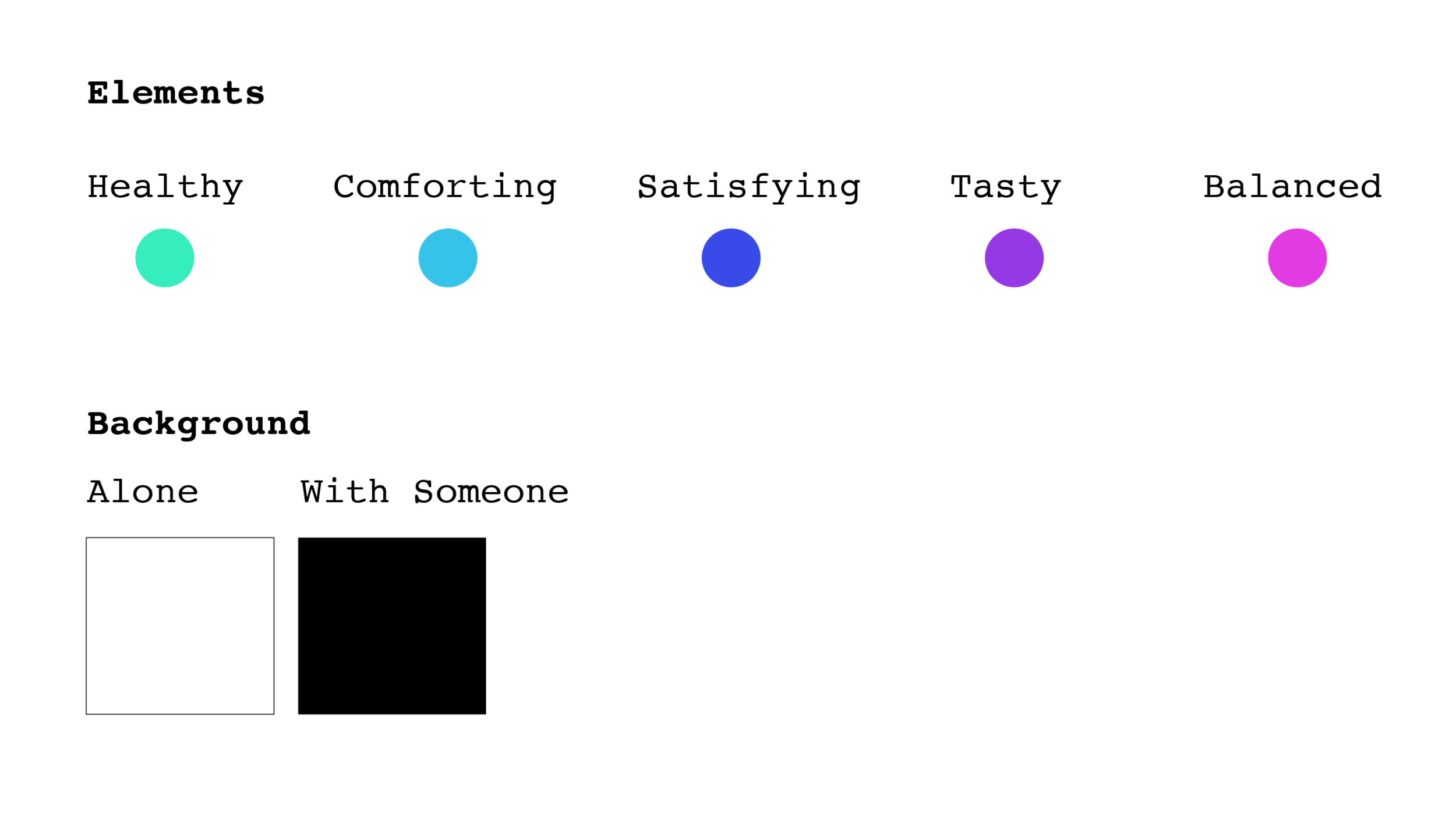
The next step was to manipulate the output of the data that was being collected, I started by dividing the circle in 5 portions, so that each data input would have an individual line and a dot, I also changed the background color for the boolean selector. When I started changing these UI I realized that it was necessary to use colors for each individual input so that I could create a symbology which will make the sketches more legible because in this moment it was not possible to correlate a dot with a data input.
The next step was to define a symbology that helped the used to understand how to read the chart, in a future iteration of this product I would like to incorporate a more intuitive symbology in the header of the HTML, however for this assignment I just decided to document it as a future goal.
Symbology
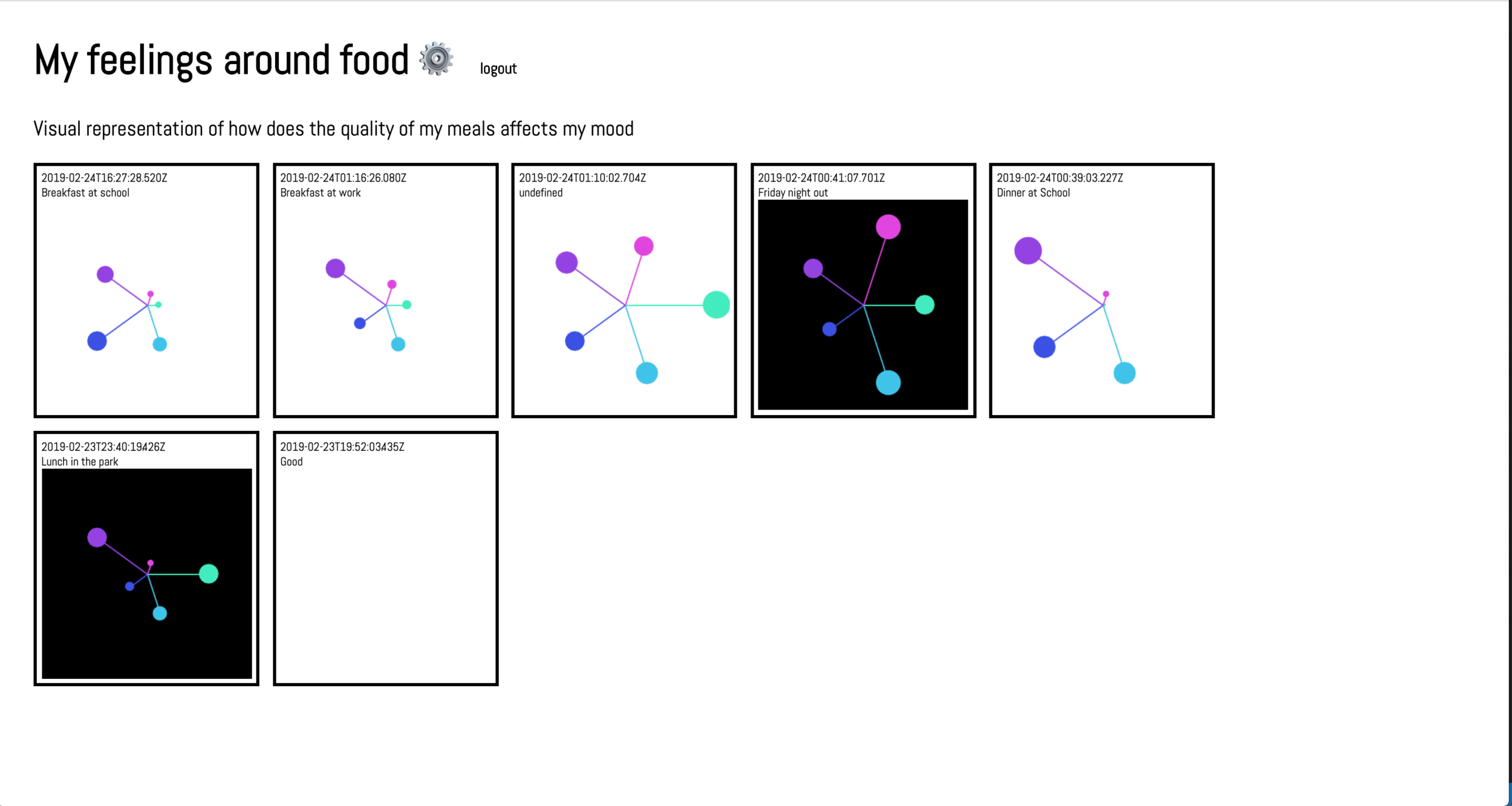
The final UI was of the Application displays 5 circles, each one will change the location relative to the center, according to the data input, and also the size of the circle will change, therefore, the closest to the center, the smaller the circle. Each data input has a different color that ideally will be visualized in a separate symbology in the header of the layout so that the user can make a quick visual correlation of the information. In a future iteration I would like to work further on the way I display the data for the user to understand faster and be able to relate to the information that is being represented.
Final UI Design


