PROTEOMIC DATA VISUALIZATION
For my archive assignment I decided to work with biological data. This is one of the reasons why I decided to take the Data Art class therefore I wanted to use this opportunity to navigate the process of collecting the data from a real organization, understanding complex data and defining a design process in order to be able to provide value out of the archived data.
I was able to collect the data from Ruggles Lab part of NYU Langone, at the beginning of my Summer internship I has the opportunity to talk to Kelly Ruggles after my colleague hard that I was particularly interested in biological data. Kelly mentioned that if I ever needed some data to play around with, to get in contact with her, therefore I thought this assignment was the perfect opportunity to get involved with some previously collected data. I also had some visual reference to one of the papers published by the Lab in which they were visualizing a similar set of data.
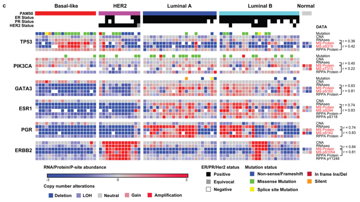
Current visualization with a similar dataset
The problem
A lot of time and resources are put into collecting data regarding tumors related to BRCA mutations. Scientists need good data visualization in order to be able to easily explore the findings of the data collection and be able to extract knowledge from the data and find patterns. Ruggles lab has developed visualizations that already enable this knowledge however I wanted to create a more visual exploration of the possibilities or designing charts with the existing data.
Coming up with a solution
I started my process with a csv file containing information about BRCA Tumors (breast cancer). Probably the biggest challenge from this assignment was to be able to filter the data and select the columns that I assumed were going to be more interesting to visualize. After selecting the data, I had to do a big amount of research in order to be able to understand what each data point meant. From id to receptors all the way to mutations, I had to make sure that I at least understood the data that I was trying to visualize in order to generate something that made sense for the researchers.


Data Structure: When I decided on which data points to visualize and I was able to have a basic understanding of it I transformed the .csv file into a .json file in order to be able to work with it with Object Oriented Programming. This process was done using a web tool that enabled me to transform the data to the format that will allow me to visualize it in a better way and work with a more structured data.
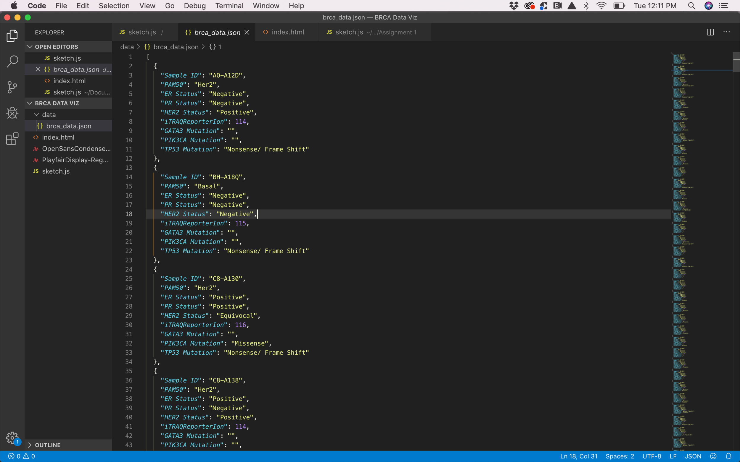
.json file for Object Oriented Programming
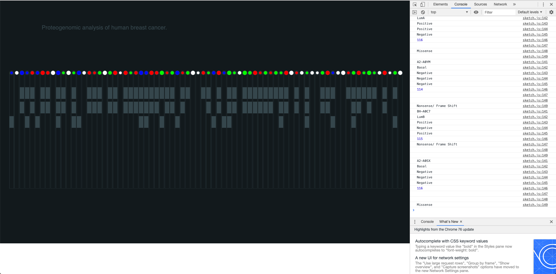
Ideation: The sketching process was crucial in order to quickly iterate and find different visual proposals that would add value to the graph. I decided to visualize each tumor in a vertical line containing all the information related to it inside a rectangle. Showing the tumor type, the receptors, the ion and the mutations in a clear way was the goal for this part of the process therefore I had to test different ways to structure and visualize the data.

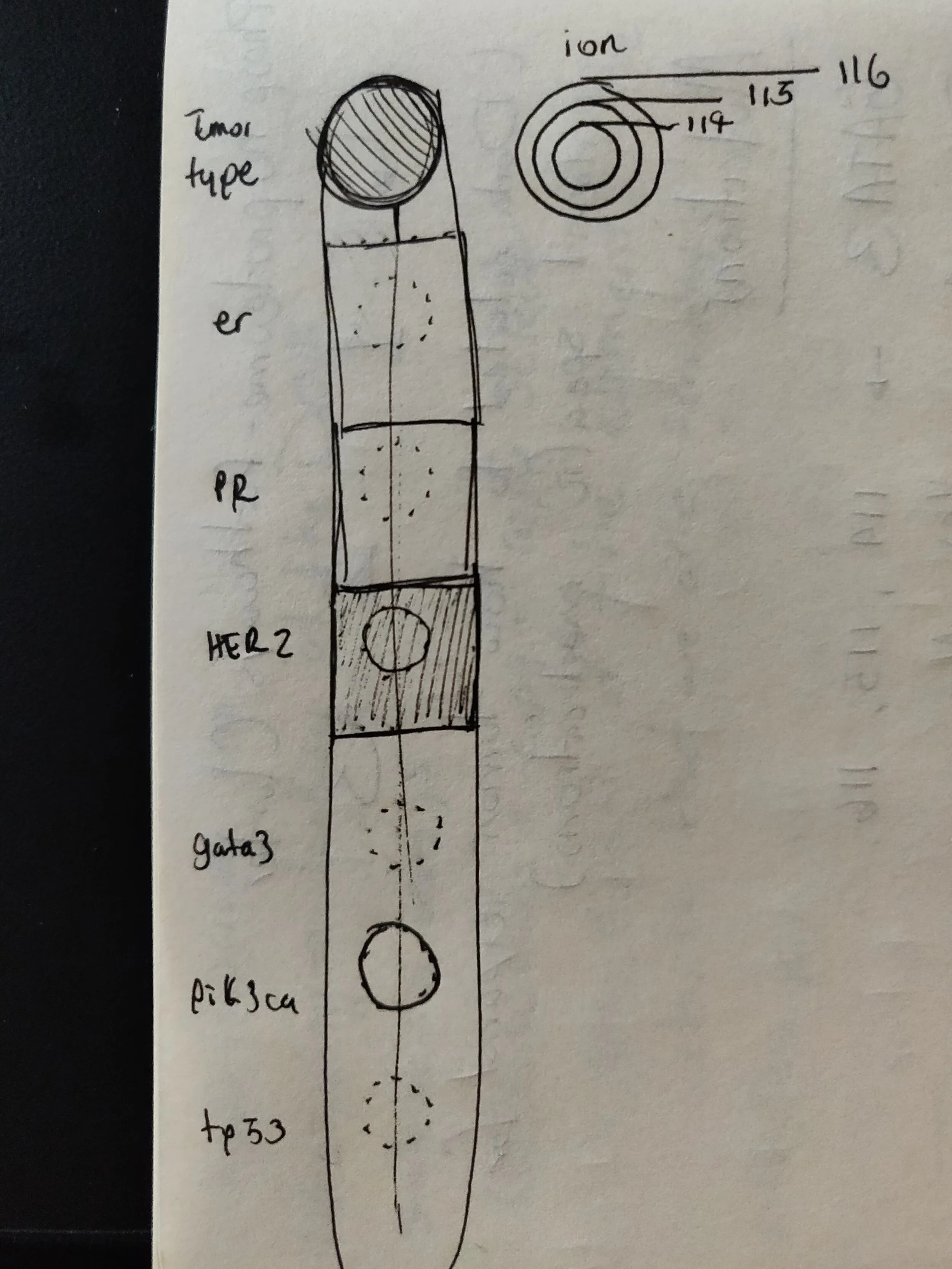
Visual Design: The visual design was very important for me because I wanted to make sure that I could create a visualization with enough legibility for the researchers, therefore the visual display of the elements and the color palette were crucial in order to ensure legibility and enough differentiation between all the data points and the different groups of data points (ions, mutations, receptors and type of tumor). The visual separation between the 4 sub-groups of data was intended to help the user read the information in a better way and using colors for only two and defining the other two (ions and receptors) in gray by only using the occupied space as an indicator helped me to visually separate the block of sub-data.
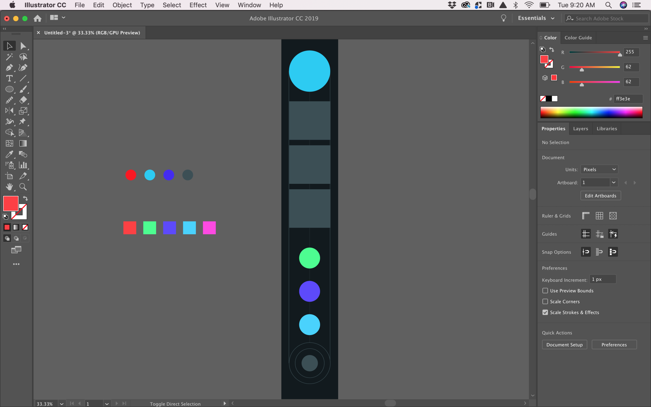
Static visual design and color palette
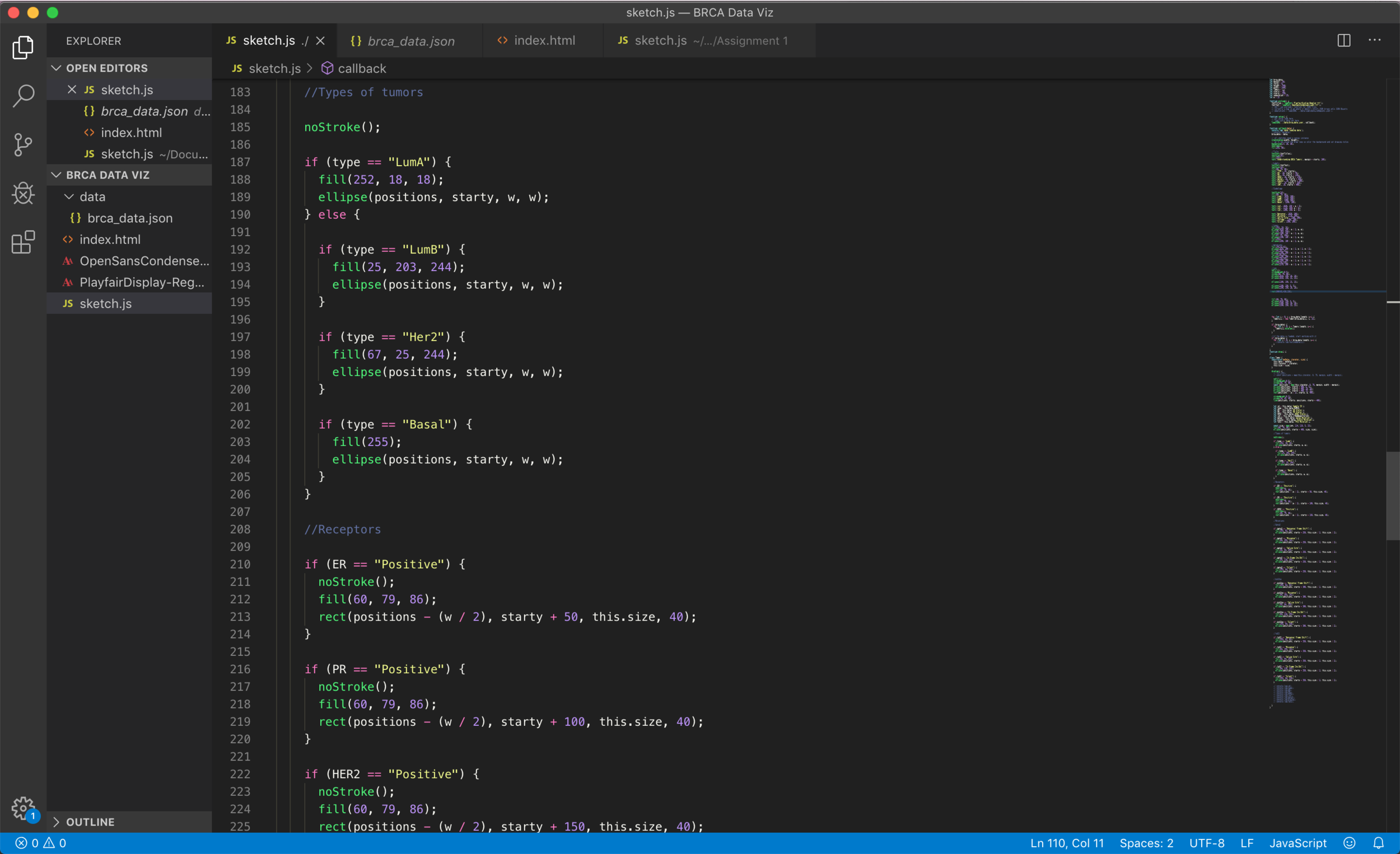
Coding: The coding process started by being able to generate an Object Oriented sketch, I wanted each tumor to be an object to be able to easily reference to it later on and extract all the data points for each one of them. I decided to visualize all the vertical rectangles (tumors) in the entire width of the screen in order to provide a way for the researcher to compare the data points next to each other.
I was able to generate a visualization that (although might not be a very efficient way of coding) is connected to the real data and shows interesting correlations between different data points and their sub-groups.
Coding Process
The result
The final result is a graph that can be viewed in the browser, which is connected to a .json file and uses p5.js in order to display the data in the canvas.
Final Design
This project was developed as part of myData Art class during my third semester at ITP NYU under Genevieve Hoffman’s mentoring.